“You Are My Sunshine”

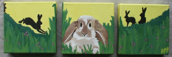
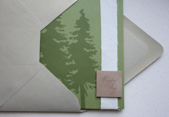
This is one shower gift that has been a longtime coming. A dear friend of mine got pregnant, oh… three years ago with her first baby girl, Gracey. In fact, she’s already on her second and third babies. They happen to be twins, but still, that’s how long it took me to finish this!

I ended up waiting to start Gracey’s painting until after she was born, and quite some time after that actually. Inspiration plays a huge part in my creating. After reading this beautiful blog post that Katie wrote – http://www.lovekatiephotography.com/blog/fridays-frame-parents/ – I hit the ground running with an idea.

I’ll let my painting do the rest of the talking. If you like it as much as Gracey does, you’ll want to color on it, too. 😉

IMG_4066

Frankie’s Stork Announcements

Been a bit busy the past couple months, but my creativity continues…

A little stork delivered the cutest Madisonian last summer. Her parents, good friends and prior customers of mine, asked me to create an announcement. A soft palette of pinks and grays with a stork were their only request.

Without further adieu, “Frankie’s” simple stork announcements. 🙂

IMG_4126

“Many memories ago..”

My parents celebrated their 40th wedding anniversary earlier this month. To celebrate, my siblings and I put together a meaningful gift to mark their special occasion. My sister-in-law Lori suggested creating a “memory jar” to hold 40 memories – one for each year of marriage. And because there are four of us kids, each family was tasked with coming up with 10 memories.

I took on the task of creating the jar. Thanks to Hobby Lobby, I found the perfect jar. Each of us siblings had one side of the jar for our families’ photos. I chose to incorporate two colors of significance – blue and red – with an accent of light brown to give it a natural feel. Powder blue was my parents’ actual wedding color and red is for the symbolic color ruby for 40th anniversaries. I personally think the jar is richer than a ruby. See for yourself below. 🙂

The bottom of the jar is on the left and says “Many memories ago…”, so after our parents read all of the memories that we wrote, they found their wedding photo at the bottom. Fun, eh? The top of the jar on the right is fairly self explanatory…

Outside

The photos below reveal the four sides of the jar, intermingled memories inside of the jar, the bottom of the jar that includes the dates, and a note attached to the jar with their current photo from my wedding last October.

Multiple_Photos

When my parents opened their gift, they chose to read each memory out loud one by one to all of us. It was great and brought out some tears, but mostly laughter. After reading the memories we all shared, we realized we could have written down many many more. After all, I’m sure 40 years of memories could probably do a good job filling up more jars than I’d care to make! Families are the best! 🙂

jar
It was a great day of celebration. Once again, Happy 40th Anniversary to my parents! Here’s to 40 more!

momanddad

“The Life of One Affects Many”

Recently, my cousin Colin asked me to work with him on a project. The Blood Center of Wisconsin and Wisconsin Donor Network were in need of a new t-shirt design for volunteers to wear at future events.

So, we set to work – Colin as the word man and myself as the design woman. A handful of design concepts later, we submitted two final designs. Though we weren’t the only design team, one of our concepts caught somebody’s eye. Before we knew it, our t-shirt design was heading to the printer!

If you decide to take in a local fair, keep an eye out for volunteers donning these shirts at the Wisconsin State Fair, the Washington County Fair and other events through the remainder of the year. They can help you become a registered organ, tissue and eye donor.

DonorShirt_2013

Food Art

Since meeting my husband, he got me hooked on an educational, practical and darn yummy cooking show called America’s Test Kitchen.

What does this have to do with art? You see, part of the show’s educational value occurs when the host brings out a “meat map” – a diagram of sorts – showing various meat cuts from the “animal of origin” used in the recipe. They go on to explain why they use certain cuts of meat for certain dishes. My husband loves the diagrams on the show, so for his birthday I set out to purchase one but I had no luck. By Googling “cuts of meat,” I found several homemade versions, and it occurred to me that I could just make them myself. Next thing I knew I was buying canvases to create my husband’s very own “meat maps.” Below you’ll find the Cuts of Beef and Cuts of Pork charts that hang in our kitchen.

Does your father or husband enjoy cooking? Don’t leave him guessing where the meat comes from on that pig or cow. Instead, consider purchasing the prints for his Father’s Day gift.

Prints can be purchased at my Society 6 online store, http://society6.com/OnceUponaCanvas.
And for a limited time, copy and paste this link – http://society6.com/OnceUponACanvas?promo=d7ee52 – for Free Shipping* through midnight on May 31, 2013.
*Offer excludes Framed Art Prints, Stretched Canvases and Throw Pillows with insert.

The pig canvas measures smaller than the cow canvas on our wall, so you, too, might want to consider ordering different sizes. Cuts of Lamb and Cuts of Chicken are on my agenda to add to the collection. Stay tuned.

Thanks for stopping and happy cooking!

beef2

Cuts of Beef [ 11×14 inch panel]

pork

Cuts of Pork [ 9×12 inch panel]

Young Peter Rabbit

After I completed Milwaukee Ties, I was ready to start a new, smaller painting. My friend Mary here in Madison was having a baby shower, so it was the perfect opportunity to create something new.

The baby shower theme and the bedding Mary chose to use in their nursery is Peter Rabbit and Friends. So cute! I don’t know if it was the carrot soup or the cabbage-filled flower centerpieces at the shower, but all my childhood memories came rushing back. (I am pretty sure the kitchen dishes I used to play with had Peter and his friends on them!)

So, going along with that theme, I present to you: Young Peter Rabbit. May he come out with all his friends soon, and possibly bring with them some real spring weather, eh?

Full

As you can see below, the nice part about painting on stretched canvases is that it allows me to extend the painting past the edges. This can provide nice contrast against the wall on which you hang the piece. It allows for a two-dimensional piece to appear more three-dimensional.

If you fell in love with this piece, or any others I have done prior to this, be sure to check out my store on Society 6: http://society6.com/OnceUponaCanvas. Custom-made pieces are always an option, too. Contact me at ouac.creations@gmail.com for your very own piece of artwork.

Side

“A Wedding Day We Will Never Forget”

Once you have chosen a wedding date and locations for your ceremony and reception, a theme or color scheme might feel like the next daunting decision. But it doesn’t have to be.

As an artist and designer, I advise couples to think about what you and your fiancé are passionate about. Everyone has a passion for something, and that passion may have been what brought the two of you together. Also think back to your engagement day. Use that day, the experience, or that feeling as inspiration. Then, try to associate your memories, thoughts and emotions with colors and images. Below you’ll find the story of how my husband and I planned a wedding day we will never forget.

***

Surrounded by tall pine trees, with a bed of their rust-colored needles under our feet, Michael dropped to one knee and asked me to marry him. I said yes. Twice. Once to give a heartfelt answer. Twice to ensure I had spoken audibly in my breathlessness.

Our engagement at Governor Dodge State Park in southwestern Wisconsin was magical. As we planned our wedding, it seemed perfectly natural to relive that day over, and over, and over, again. We knew that through our invitations and decorations, we could invite our family and friends to experience the same magic we felt that day.

As an artist and designer, I’ve designed several wedding invitations for other couples. I knew that continuity and consistency would be important: Our “save-the-dates” would kick-start our theme, our invitations would provide our guests with a sneak peek of our wedding day, and our decorations would immerse them in the experience.

Our “save-the-dates” debuted our wedding colors, as well as a graphic and materials we would later use in our invitations and programs.

OurSTD

I incorporated natural materials with lots of texture into our invitations. The main card was printed on linen fabric, the pocket cards were printed on Kraft paper, and a moss-colored raffia held all the pieces together. Every compliment I received assured me they were worth all the time and effort. I wouldn’t have done them any other way.

Our_Invites

I infused natural elements into all of our dinner decorations. Mason jars, wrapped with raffia and ribbon, were filled with moss, pine needles (from the trail where Michael proposed to me) and water for floating candles. Holding our beautiful hydrangeas, they sat on cross-sections of a tree (some folks call them “tree cookies”). For table runners we used raw, custom-cut burlap. Our table numbers were faux Polaroids created from photos that our friend and matchmaker Katie (a wedding photographer) snapped the day of our engagement. You can find her beautiful blog post with the photos here.

OurDecor

Walking into our reception, we were taken back to that day at the park where we said “we will.” Once again, we were breathless. And so were our guests.

***

Our wedding day came together beautifully, and yours can, too, by incorporating all the things you and your fiance love into your invitations and decorations. To have your wedding invitations custom-made, contact me at ouac.creations@gmail.com or through BB10 Creative at bb10creative@gmail.com.

Before I sign off, a big thanks to my friend Lisa (a wedding photographer) who snapped the above shots of all the decorations and elements at our wedding that we worked so hard on!

Milwaukee Ties

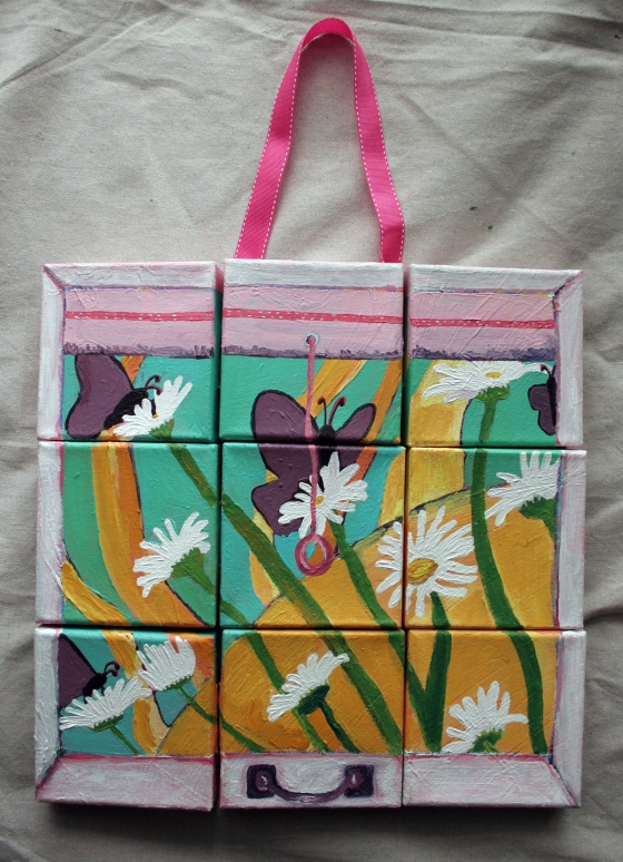
Baseball season is under way and Miller Park has opened its roof, so it’s an appropriate time to share a new piece of artwork with you! Milwaukee Ties has reached its completion point and is in the hands of happy, repeat customers of mine.

Ian and Kristine came to me 4 years ago in need of some paintings to hang in their little boy’s bedroom. They were so happy with them that when baby No. 2 (also a boy) came along late last summer, they contacted me again. Rather than create two smaller paintings (Wade on Safari and Wade’s Pastime) like I did for their firstborn, they had me paint one large three panel piece. Their only request was that it was city-themed and done in bold, bright colors – red, green, blue, yellow, orange, and brown.

Ian and Kristine are both from the Milwaukee area, so the “city theme” quickly turned into a “Milwaukee theme.” Throughout the piece you’ll find all things “Milwaukee” – Miller Park, Klement’s sausages, Secret Stadium Sauce, Lake Michigan, the U.S. Bank building along with more of the skyline, and the Calatrava-designed Milwaukee Art Museum.

If you would like a painting to adorn your own child’s wall, contact me at ouac.creations@gmail.com for an estimate.

MKE_painting

Rustic and Romantic Wedding Invitations

When I met with Kristin and Jay to work on their wedding invites, I was pleasantly surprised to find how closely their wedding vision – rustic, romantic, and with lots of texture in the decorations – aligned with mine and my husband’s.

Before meeting with them, I gathered some samples including the mockup for my own wedding invitations. It was less traditional than most of the designs I’ve done, so I threw it in the mix to share. Low and behold, those were the invitations they gravitated towards. In the end we morphed their vision into an invitation that used similar elements (Kraft paper, linen cloth, brown and green hues) from my wedding invitations, but was unique to their own style.

Without further ado, Kristin and Jay’s Wisconsin Dells destination wedding invitations. Supplies include a linen belly band, Kraft paper, Paper Source moss cover stock, and Cards & Pockets sand (metallic) mailing and RSVP envelopes.

IMG_8008

KJ_2012

The RSVP envelope and inside cards (RSVP, weekend itinerary, and directions) were held in place by the linen belly band that wrapped around the cover flap.

InsideCards

Thanks for stopping by to view these beautiful new invitations. Be sure to check back soon for more invitations and some paintings I have been working on!

Classic Lace

I am eager to share a few new wedding invitations I created this past year.

First, an observation I’ve made through working with several brides and grooms: Couples come to you with different needs, wants, expectations, and questions. Some have no idea what they want and others know exactly what they want. Rest assured, either way, I will work with you to ensure you will have beautiful wedding invitations… ones you are excited to send to your dearest family and friends.

One couple I met with claimed to be in the dark about what they wanted. I begged to differ. At our first meeting they brought along with them scraps of mauve ribbon and ivory lace they wanted to incorporate into their wedding invitations. They came to me with a subtle idea, but an idea my creativity and eye for design could run with. They ended up with a wedding invitation that truly fit their vision.

Michael and Teresa used the dark grey “Vertico” style enclosure from Cards and Pockets with an opal (metallic) envelope. Those, paired with a pretty lace design, made for clean and classic-looking invitations.

Stay tuned for more wedding invitations and paintings I have been working on recently!

Michael & Teresa Invites